InsightsAI-Native Macro Research in Practice: Building and Operationalizing a PPP FX Model
AI-Native Macro Research in Practice: Building and Operationalizing a PPP FX Model
See how CountryRisk.io combines macro data infrastructure, AI agents, and automated model pipelines to turn FX valuation analysis into a workflow.
Bernhard Obenhuber May 29, 2026
A PPP-Based FX Valuation Model Built on CountryData.io
Foreign exchange is noisy in the short run. Rates respond to interest-rate expectations, political risk, balance-of-payments pressure, portfolio flows, liquidity, and positioning. Yet macro analysts still need a slow-moving anchor — a way to ask whether a currency has drifted far from the level implied by relative prices.
The PPP-based FX valuation model described here is designed for that purpose. It turns CPI and exchange-rate data from CountryData.io into two monthly indicators: a PPP-implied fair value of the exchange rate, and the deviation of the observed rate from that fair value. Both are written back into CountryData.io, making the model output available in the same macro-data environment as the raw inputs.
We also use the FX model to show how modern data and technology infrastructure can support economists in their daily work. It illustrates the full research workflow: sourcing data, building and maintaining models, keeping datasets up to date, and distributing insights efficiently.
Why FX Valuation Models Matter
FX valuation models are not trading systems. Their job is to provide structure around a question that otherwise becomes narrative-heavy: is the exchange rate broadly consistent with economic fundamentals?
For sovereign-risk, macro, and cross-country analysis, a valuation model helps in several ways.
It gives analysts a common yardstick across countries. A spot exchange rate by itself says little, but its distance from a transparent fair-value estimate is far easier to compare across economies.
It separates cyclical market pressure from a longer-run anchor. A currency can remain expensive or cheap for years, but a persistent and widening gap remains analytically useful — it signals accumulating valuation strain that may eventually correct or require policy adjustment.
It creates a time series that can feed into broader risk frameworks. Misalignment can become an input to external vulnerability assessments, inflation pass-through models, currency-crisis indicators, or composite sovereign-risk scores.
And it forces discipline. The same calculation is applied consistently across countries, rather than changing the story case by case.
The Practical Burden of Building Cross-Country Models
The methodology behind a PPP valuation model is not complicated. The hard part is everything around it — the data work, the operational overhead, and the gap-filling logic that nobody writes about but everyone who has built these models knows well.
Data sourcing is the first obstacle. Finding the right CPI and exchange-rate indicators sounds straightforward until you try to assemble a consistent panel across 100-plus countries. Providers differ in frequency, base years, seasonal adjustment, and coverage. You pick a source that works for major economies, build out the model, and then discover that a handful of countries you care about — often the most analytically interesting ones — are simply missing. At that point, you either accept the gap or start stitching in data from a second or third provider, each with its own quirks.
Handoff and reproducibility are the second. A model that lives in a single analyst's workflow is fragile. Telling a colleague how to update it means documenting a labyrinth of spreadsheets sourced from different data providers, explaining which tabs pull from which vendor, and flagging the small but consequential adjustments that each update cycle requires — extending a calculation window here, changing a ticker there. Script-based models reduce some of this pain, but they introduce their own version: a colleague who is not the original author has to understand just enough of the code to make the right tiny changes per update without breaking anything. In practice, many models are updated by exactly one person, and when that person is unavailable, the model is too.
Reporting lags are the third. CPI data typically arrives with a delay of one to several months. For a model that is supposed to inform current analysis, missing data for the most recent periods is a real problem. The choice is usually between leaving the latest months blank — which makes the model feel stale — or applying some form of forward fill or trend extrapolation to bridge the gap. Neither option is perfect: forward fill is conservative but can mask turning points, while trend-based extrapolation is more responsive but introduces model risk. Getting this right, and being transparent about where observed data ends and estimates begin, is a recurring design decision.
These are not glamorous problems. But they are the ones that determine whether a model actually runs reliably across countries and over time, or whether it quietly breaks the moment conditions change.
Methodology
The model uses purchasing power parity, anchored to the United States as the base country. The core calculation is absolute PPP: the fair exchange rate at any point in time is proportional to the ratio of domestic CPI to US CPI, scaled by a constant calibrated at a baseline date so that the fair value equals the observed spot rate at that point.
Misalignment is then measured as the percentage deviation of the observed spot rate from the model-implied fair value.
The spot series is quoted as domestic currency per US dollar. Under this convention, a positive misalignment means the observed rate is above the PPP fair value — economically, a weaker local currency (or stronger US dollar) than the CPI-based anchor implies. A negative misalignment points to a stronger local currency than PPP would suggest.
The baseline date matters. The model calibrates the scaling constant at the first available observation after 1990 for each country, so the entire fair-value path is anchored to conditions at that point. Sensitivity analysis around the baseline choice is a useful extension, since an unusual starting exchange rate can shift the entire trajectory.
Reading the Sample Charts
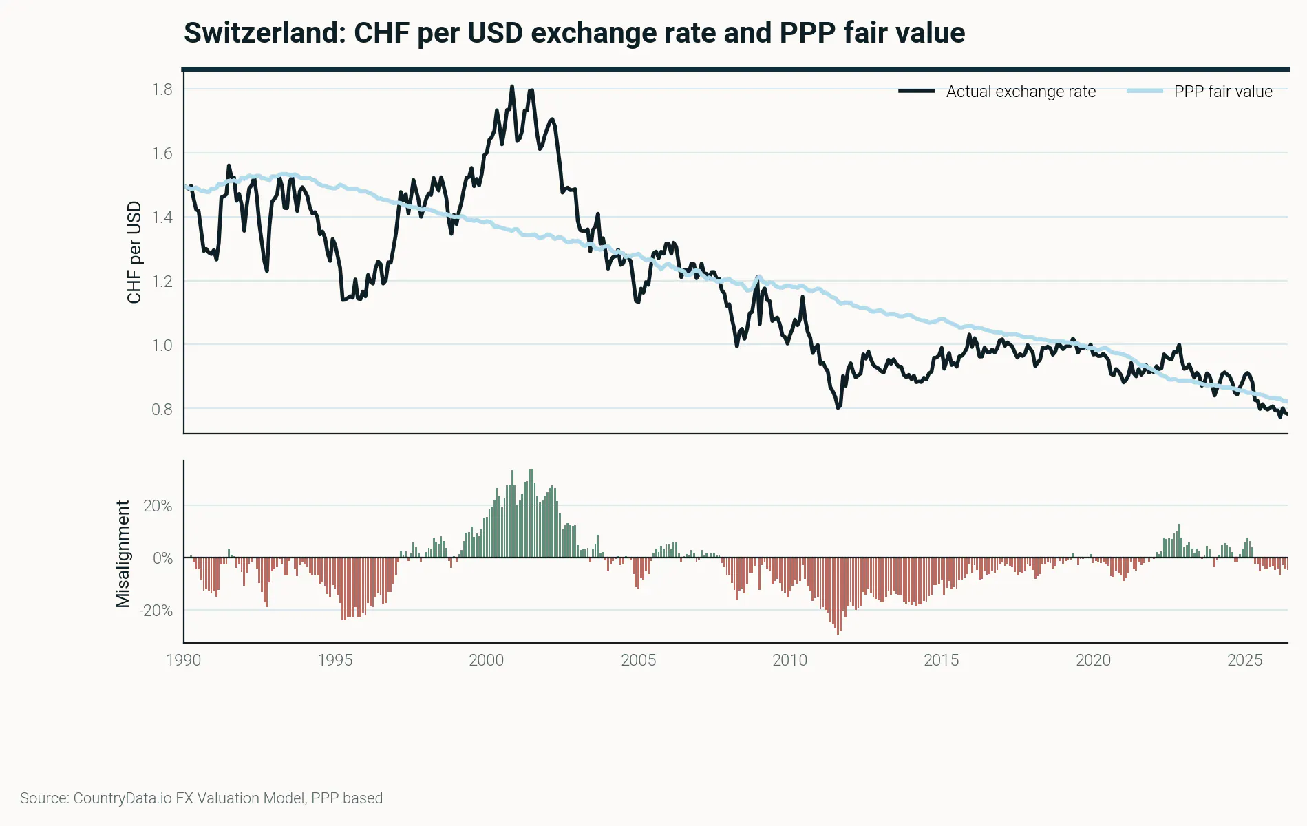
The sample charts use published model outputs from CountryData.io. The latest observations are mapped to the current month-end, since the model assigns the most recent daily quote to that date. Here the output for Switzerland and LLM generated currency valuation comment:
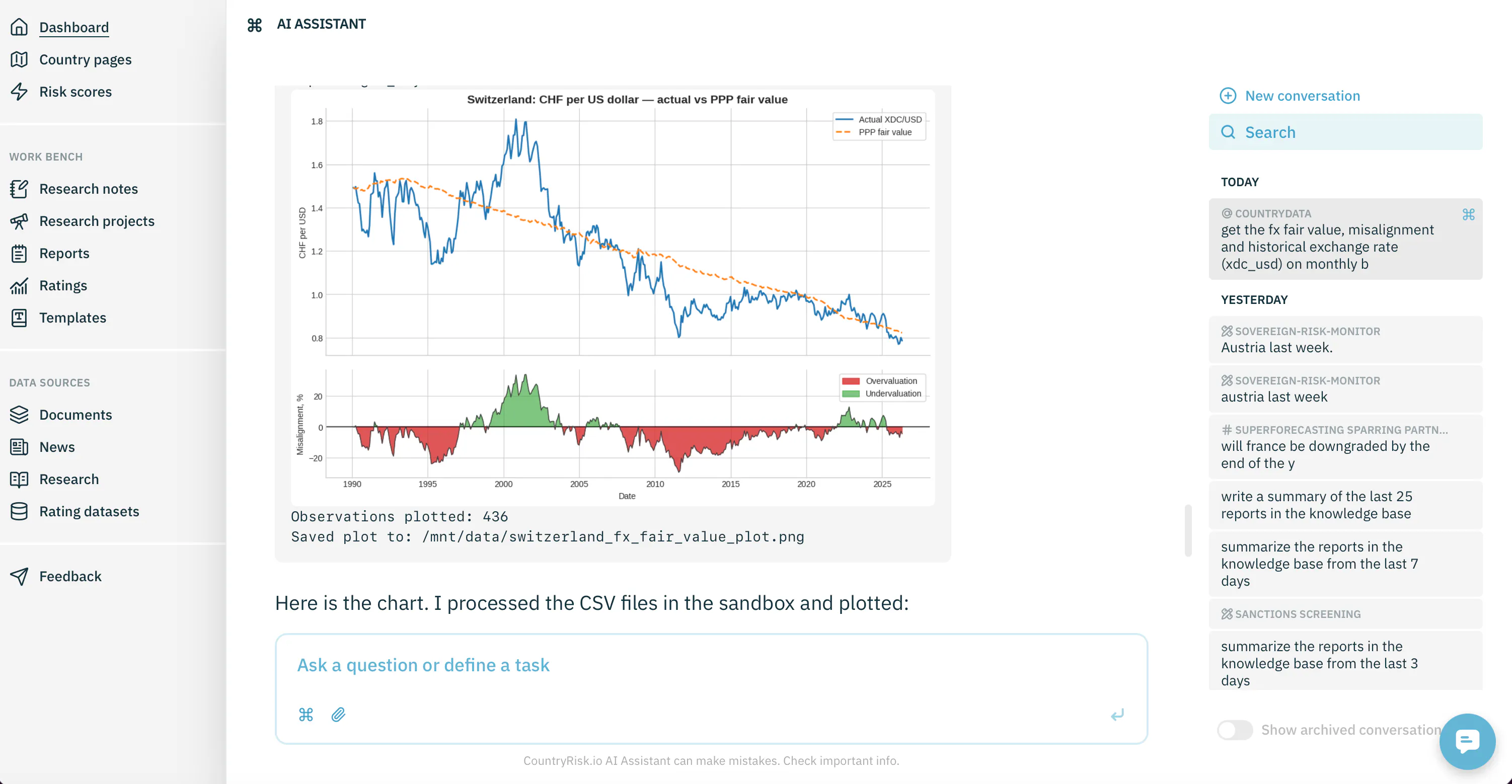
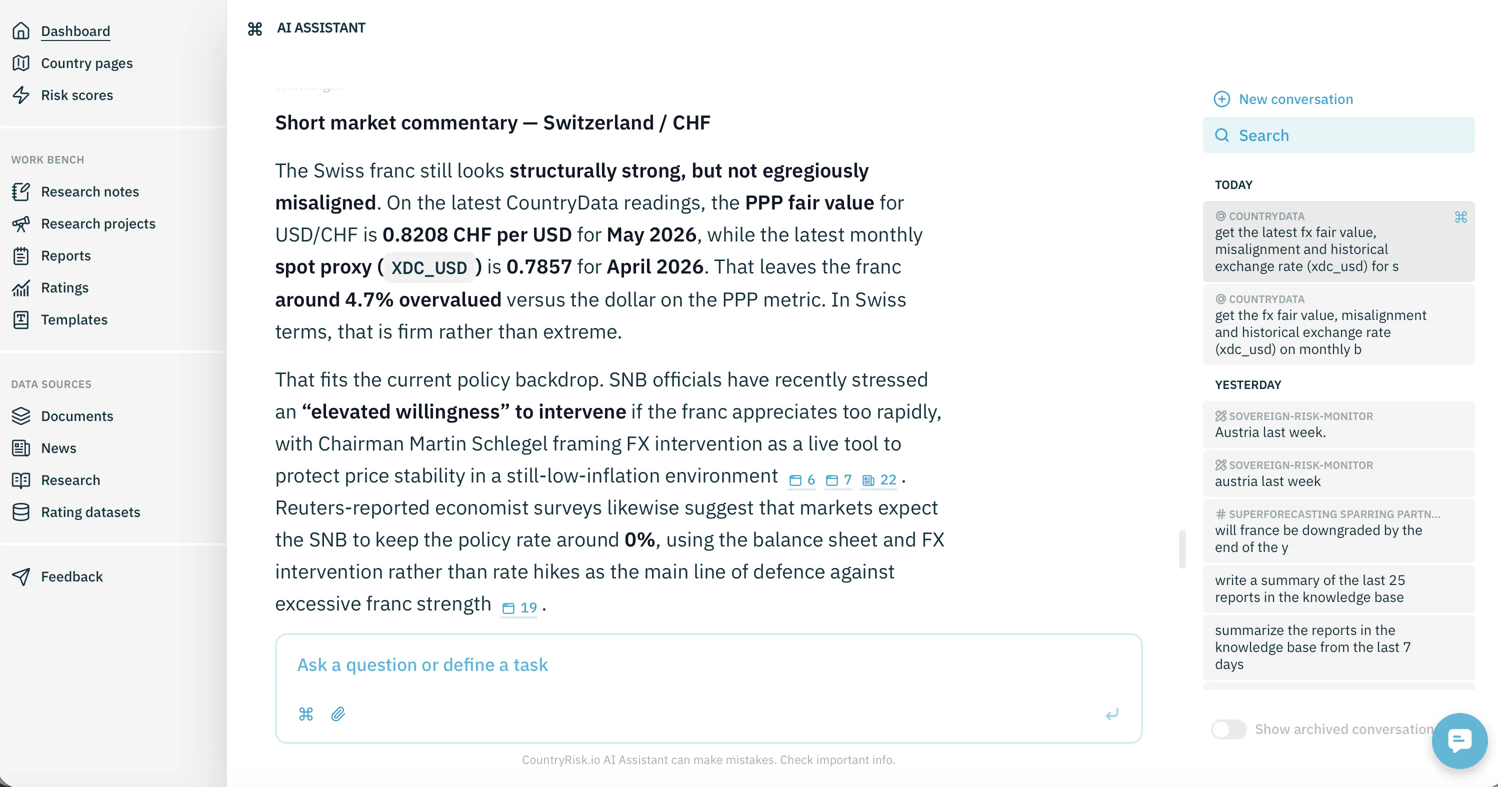
The Swiss franc screens as moderately overvalued against the US dollar on the PPP model. As of May 2026, the actual exchange rate is around 0.78 CHF/USD, below the PPP fair value estimate of about 0.82 CHF/USD, implying a misalignment of roughly -4.7%.
In long-run context, this is not an extreme valuation. The franc has spent extended periods much further above fair value, especially in the mid-1990s and again after the global financial crisis. The latest reading suggests the CHF remains somewhat expensive versus PPP, but less stretched than in earlier overvaluation episodes.
These signals should not be read as timing calls. They are better understood as valuation pressure indicators — a compact, comparable measure of how far spot FX has moved from a CPI-based long-run benchmark. When used alongside other macro variables, they can sharpen the analytical picture of where currency risk is building.
Shortcomings
PPP is a long-run valuation anchor, not a complete FX model. CPI baskets differ across countries and include non-traded goods. Productivity differences — the Balassa-Samuelson effect — can justify persistent real exchange-rate gaps. Capital flows, terms-of-trade shocks, monetary policy, fiscal credibility, risk premia, and exchange-rate regimes can all dominate PPP for extended periods.
The anchor date is also important. Because the model calibrates to a single baseline observation, an unusual starting rate shifts the entire fair-value path. Analysts should be aware of this sensitivity, and the model supports robustness checks around baseline selection.
Finally, the output depends on the availability and quality of CPI and spot FX data. Missing or revised source data can affect results, though the model includes alignment and gap-filling steps to mitigate common data interruptions.
Data Inputs
The model draws on three data streams available through CountryData.io: domestic CPI, US CPI, and spot exchange rates. The spot series combines monthly IMF exchange-rate data with daily market quotes from a different data provider, using the IMF series for historical consistency and the latest daily observation to keep the most recent data point timely. Where CPI publication lags by a few months, a lightweight extrapolation based on recent trends keeps the latest valuation operational — not as a forecast, but as a bridge until official data arrives. This is a deliberate choice to keep the model useful for current analysis while being transparent about where hard data ends and estimation begins.
All series are aligned to month-end frequency, with conservative gap-filling logic for small interruptions in coverage.
The Role of GenAI in Data Assembly
One dimension of this problem has shifted significantly in recent years. Assembling a consistent data panel used to involve a difficult trade-off: you could pick one data source per country-indicator combination for the sake of consistency, or you could chase better coverage by pulling from multiple providers — but checking whether 100-plus tickers across different vendors are actually comparable was prohibitively time-consuming.
Generative AI has changed that calculation. Tasks like matching indicators across providers, verifying comparability of series definitions, and stitching together panels from heterogeneous sources are exactly the kind of structured-but-tedious work that large language models handle well. What used to be a bottleneck — the manual cross-referencing that made multi-source panels impractical — is now fast enough to be routine. The result is that models can draw on richer, more complete data without the analyst spending days on ticker-by-ticker verification.
With the CountryData.io MCP, we can just tell our preferred LLM tool (codex, claude code, ChatGPT and of course the CountryRisk.io Insights platform) to look through all available indicators, find the best one for our task at hand and retrieve the data. That makes model building and testing a joyful experience.
This does not eliminate the need for judgment about data quality. But it removes the practical constraint that used to force analysts into one-source-per-indicator shortcuts.
CountryData.io as a Macro-Data Pipeline
The model is intentionally compact because CountryData.io handles much of the pipeline burden — and, in doing so, addresses the practical pain points described earlier.
The data-sourcing problem is largely absorbed by the platform. CountryData.io provides a unified data layer across IMF CPI, IMF exchange rates, and daily market FX. The model can request data by country, indicator, and source rather than maintaining separate vendor-specific download logic. When coverage gaps appear for specific countries, the platform's multi-source architecture makes it possible to pull in alternative series without rebuilding the pipeline from scratch.
The handoff problem is addressed by the way the platform separates model logic from data plumbing. Once the PPP fair value and misalignment series are written back as CountryData.io indicators, they have the same structure as source data — they can be queried, charted, monitored, and consumed by downstream models exactly like any other macro series. The model code stays focused on methodology. There is no spreadsheet labyrinth to explain and no vendor-specific download scripts to maintain. A colleague who needs to understand or modify the model only has to engage with the calculation itself, not with the surrounding infrastructure.
The platform also handles deployment and scheduling. Once registered, the model runs automatically every night, picking up the latest source data without manual intervention. When underlying inputs are revised — a common occurrence with IMF CPI or exchange-rate series — CountryData.io tracks those revisions in a full audit trail, so analysts can see not only the current model output but also how and when it changed.
That is the core benefit of a purpose-built macro-data pipeline: the boundary between raw data and model output becomes clean. The model stays focused on methodology. CountryData.io provides source integration, country metadata, observation storage, indicator definitions, automated scheduling, revision tracking, and repeatable import execution.
CountryRisk.io Insights Platform
Once a model — such as the FX valuation example shown here — is deployed on the CountryData.io platform, it is automatically updated every night. The results are then made available through multiple delivery channels: via MCP for integration into AI tools, through a standard API for ingestion into external databases and workflows, and directly within the CountryRisk.io Insights platform.
This broad distribution approach reflects one of our core principles: data should be accessible wherever the user works.
The CountryRisk.io Insights platform is designed as a comprehensive environment for macroeconomic research. It not only brings together data and analytical content, but also provides a fully integrated workbench for producing research reports, conducting deep research projects, generating sovereign ratings, and much more. If you know of a more capable platform for macro research, we would genuinely like to see it.
Let’s now look at how users within an organization can access the FX model output.
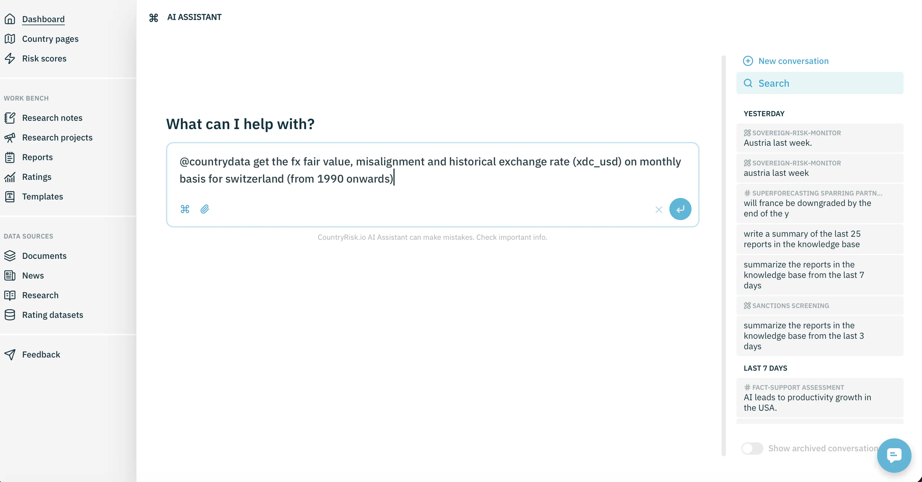
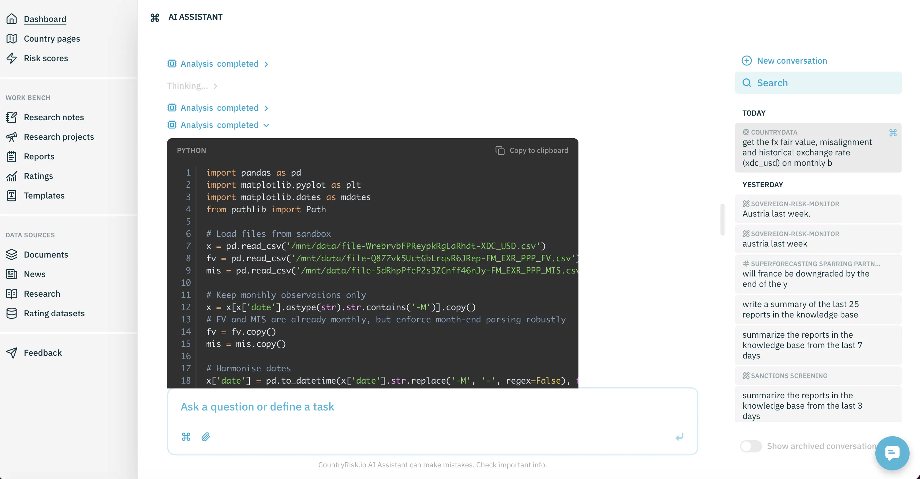
We begin by opening the AI Assistant on the platform and asking for the latest FX valuation and spot exchange rate data for Switzerland. The orchestration agent evaluates the request and automatically calls the relevant tools available through the CountryData.io MCP to identify the appropriate indicator tickers and country codes.
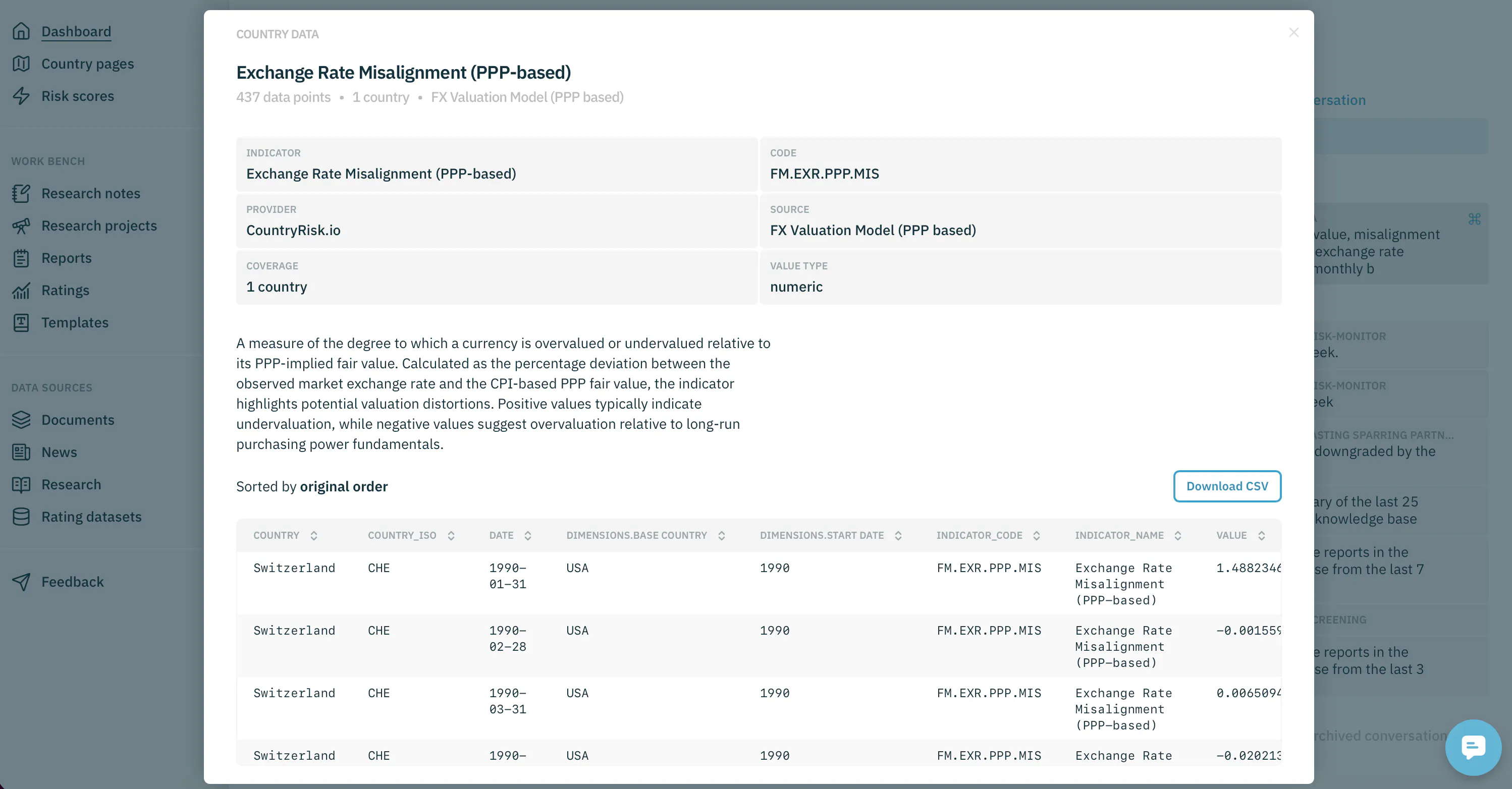
The retrieved data can then be inspected directly within the built-in viewer. Users can scroll through the latest observations, review the associated metadata, and download the dataset as a CSV file.
Of course, reviewing a long spreadsheet of data is rarely the end goal for an economist. More often, the objective is to understand how current valuations compare with historical levels and to produce a concise analytical commentary supported by charts.
So let’s get to work.
We instruct the assistant to generate a chart showing the actual exchange rate and estimated fair value in the upper panel, with the corresponding FX misalignment displayed in the lower panel. The chart is produced instantly.
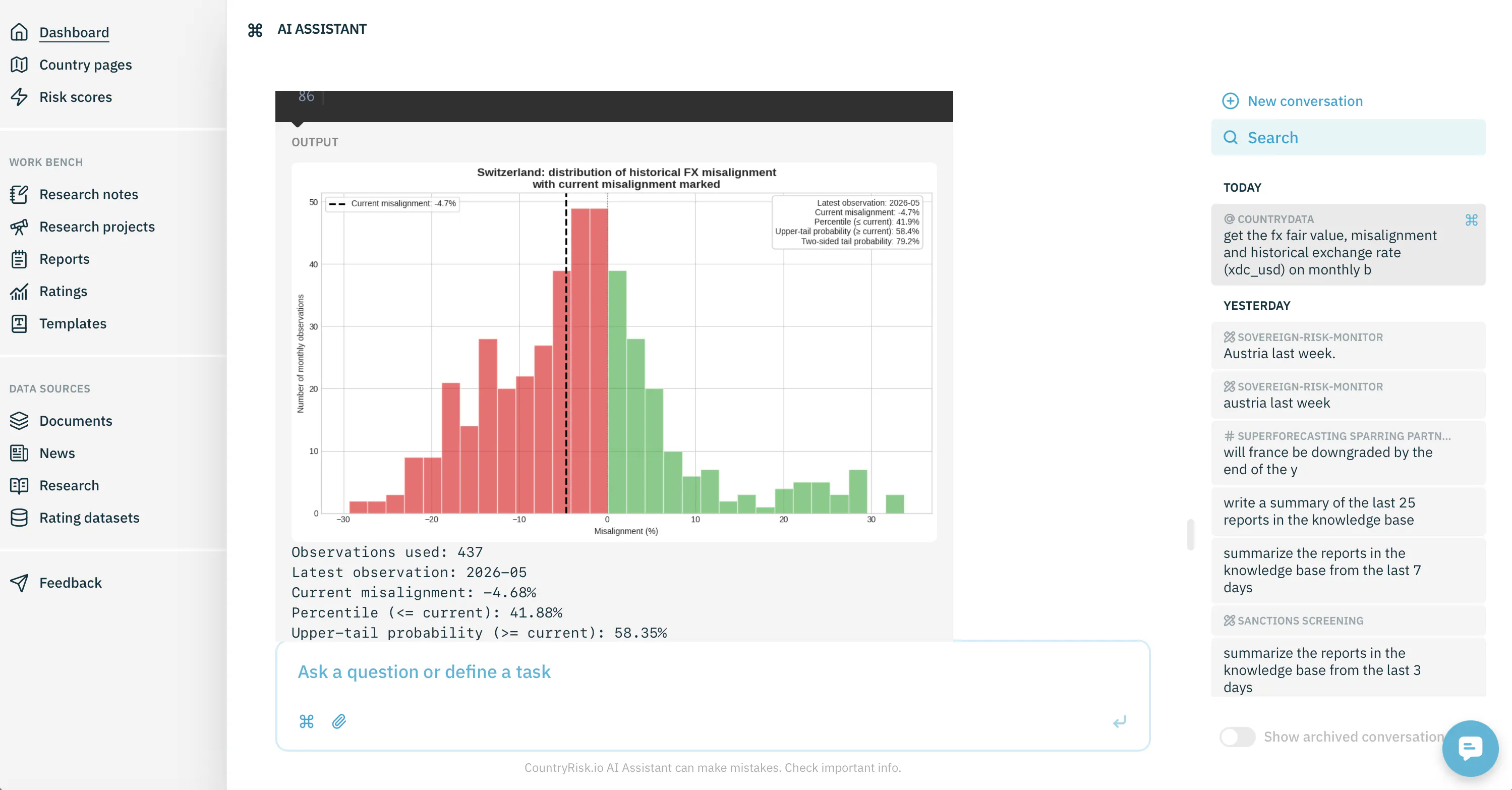
To provide additional context, we also ask the assistant to create a histogram that places the current misalignment into historical perspective.
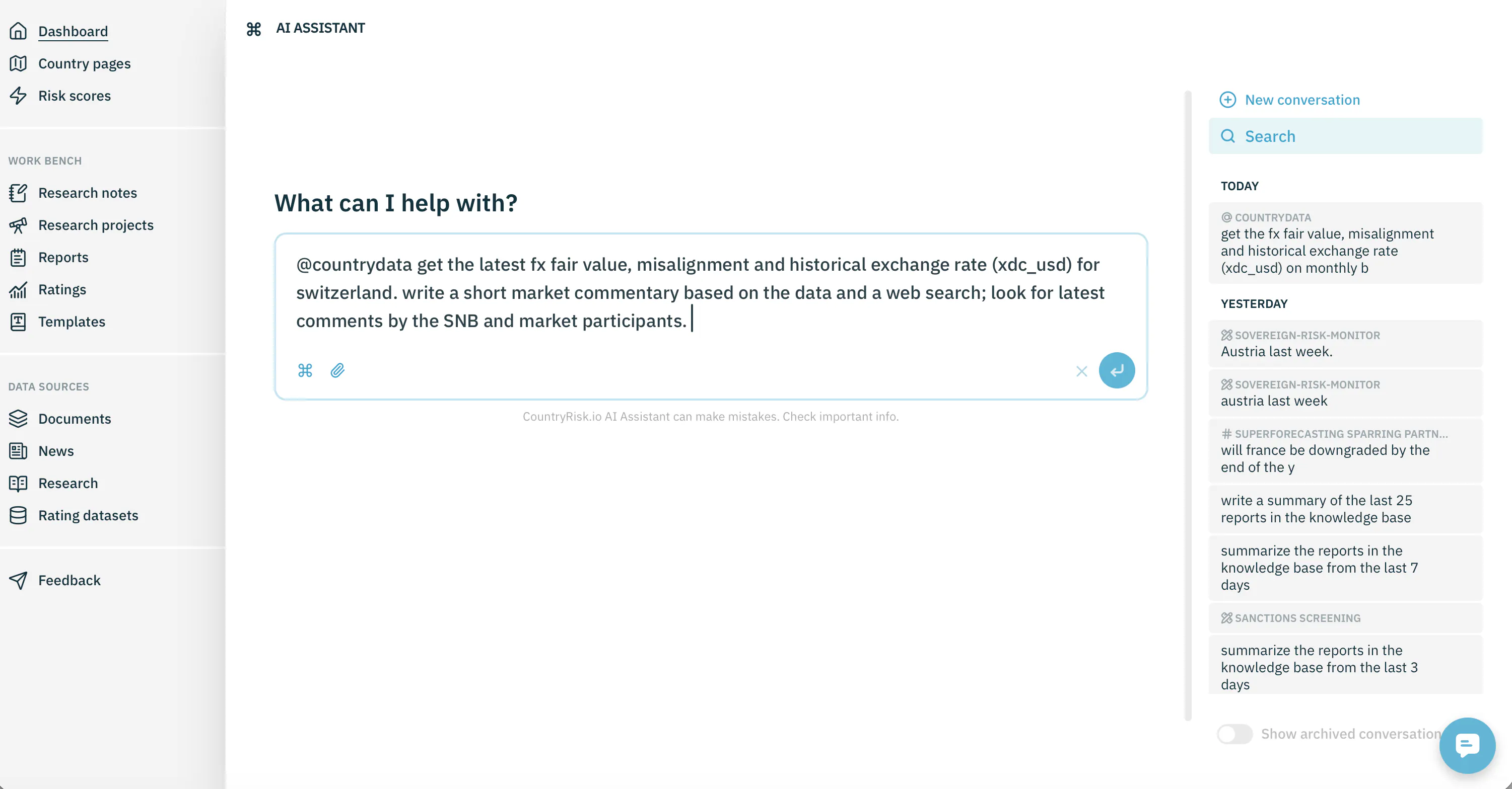
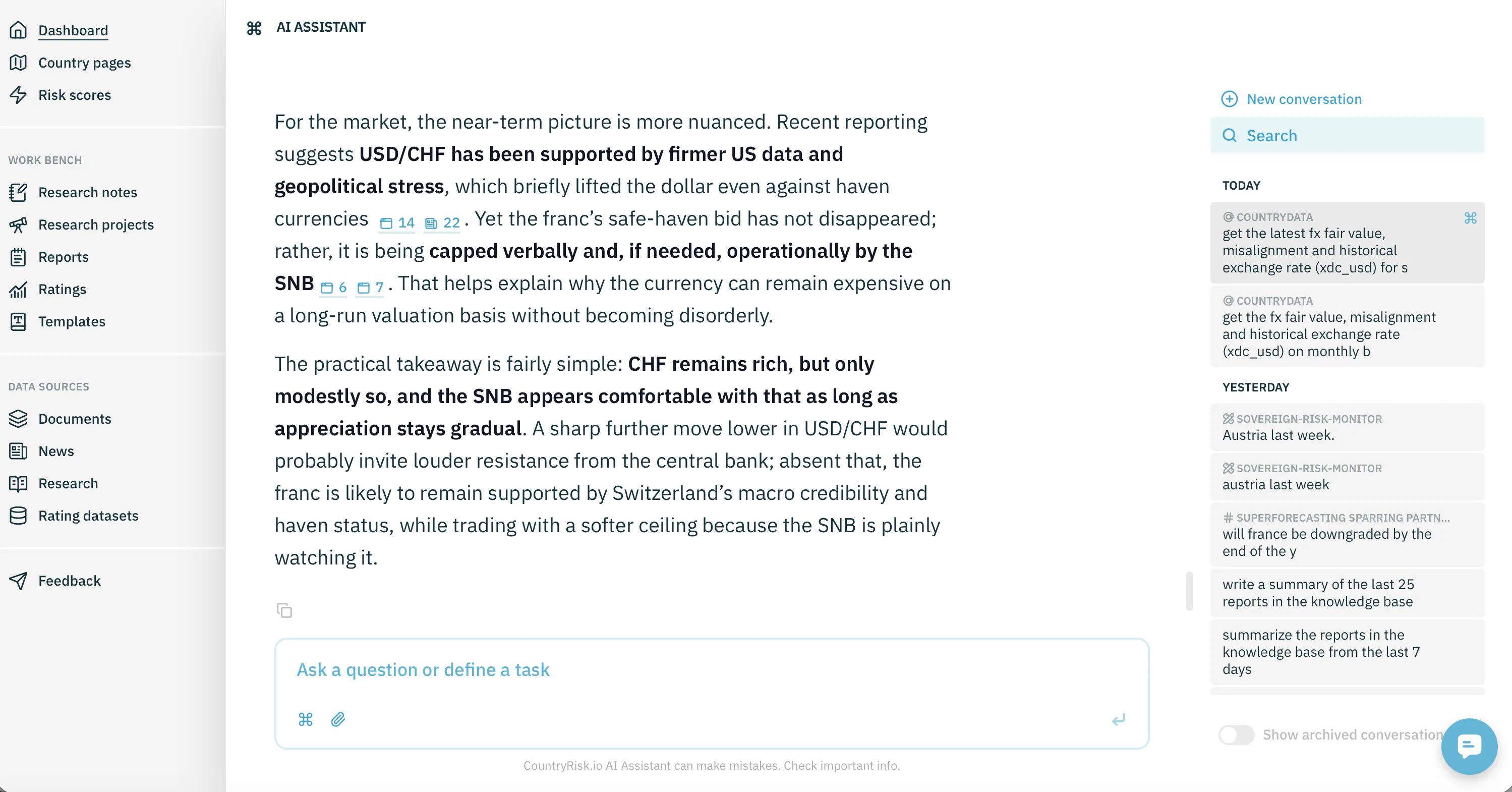
Finally, we want to produce a short write-up enriched with context from Swiss National Bank views and recent policy actions. The AI Assistant analyzes the request and generates the following commentary:
AI-Native Infrastructure for Modern Macro Research
CountryRisk.io combines a purpose-built macroeconomic data infrastructure with modern AI-native research workflows. Through CountryData.io, economists and analysts can source, maintain, and deploy cross-country models without the operational burden traditionally associated with macro research pipelines. The platform automates data integration, model updates, revision tracking, and distribution, while the CountryRisk.io Insights platform transforms those outputs into actionable research through AI-assisted analysis, charting, reporting, and sovereign-risk workflows. The result is a unified environment where data, models, and research production come together — enabling teams to spend less time managing infrastructure and more time generating insight.